

Charts that answer the questions a list of issues cannot: are we closing as fast
as we open, where is effort actually going, who is carrying what, and which
projects are drifting. Four tabs — Lifecycle & flow, Time & effort,
Team & workload and Project health — over one project or across everything
you can see. Every figure explains how it was calculated, so a number can be
argued with rather than merely believed.
On RedminePRO Cloud
Availability
Business and above.
Turn it on
Per project: Project → Settings → Modules → tick Statistics. A
Statistics entry appears in the project menu, and Statistics — all projects
in the top menu for the cross-project view.
Permissions
Administration → Roles and permissions, in the Statistics section:
| Permission | What it grants |
|---|---|
View statistics |
Open the charts for that project, and include it in the all-projects view |
Everything is computed from issues the reader may already see, so the permission controls access to the analysis, never to data behind it.
Settings
Administration → Plugins → RedminePRO Statistics:
| Setting | Default | Effect |
|---|---|---|
Overdue % — green below |
10 | A project's traffic light is green below this percentage of overdue issues |
Overdue % — amber below |
25 | Amber below this, red at or above it |
Global page projects |
All projects the viewer may see |
Or Only the selected projects, chosen in Selected projects |
Cache TTL (seconds) |
3600 | How long an aggregated figure is reused before it is recomputed |
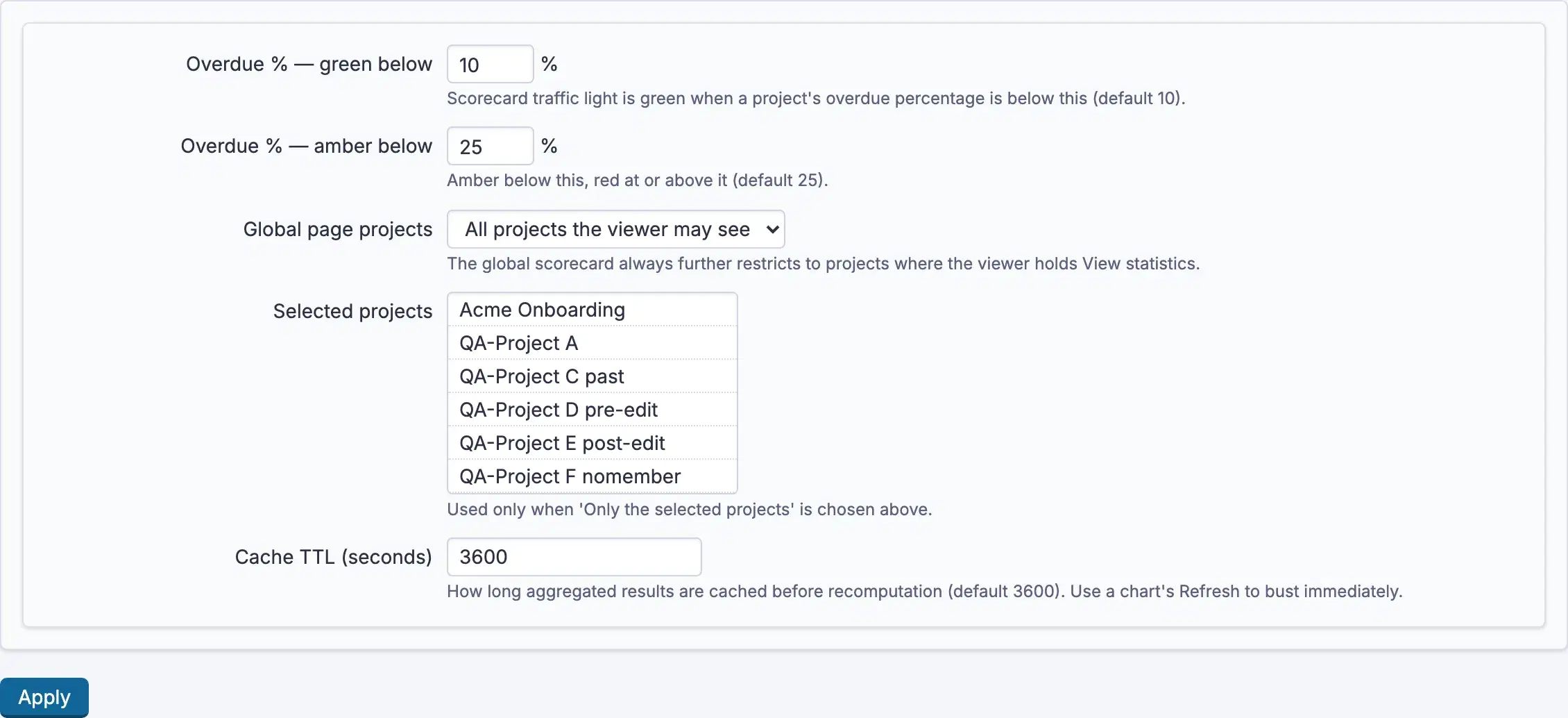
The two thresholds turn a percentage into a colour on Project health. Set
them to match how your organisation actually judges lateness rather than leaving
the defaults to decide. The all-projects view always narrows further to projects
where the reader holds View statistics, whichever scope is chosen.
Using it
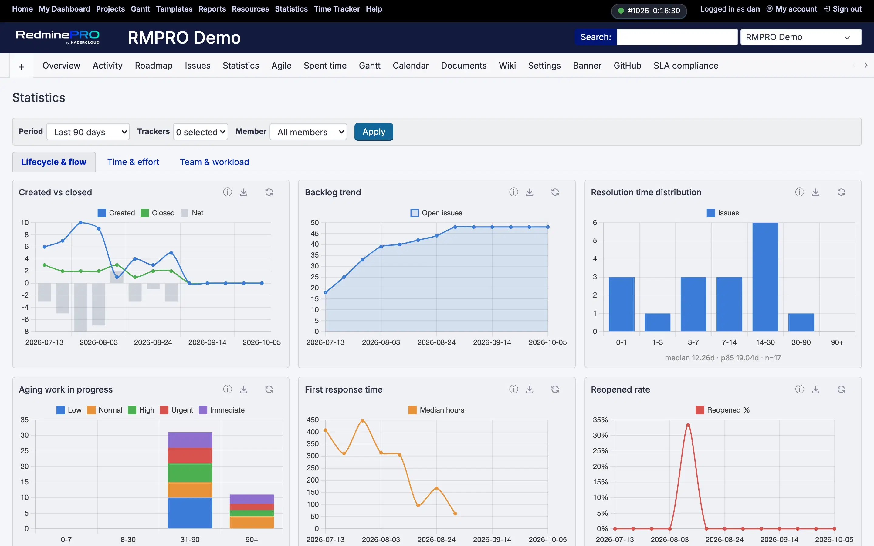
- Open
Statisticsin a project, orStatistics — all projectsfrom the top menu. - Choose a
Period:Last 30 days,Last 90 days,Last 6 months,Last 12 months, orCustom rangewithFromandTo. - Narrow by
Trackersand byMember—All membersis the default. PressApply. - Move between the four tabs.
Created vs closedonLifecycle & flowis the quickest read on whether the backlog is growing. - Group effort
By activityorBy trackeronTime & effort. How this is calculatedunder any figure shows the rule behind it.Export CSVtakes the current view away with you;Refreshrecomputes rather than reusing the cached figure.
Troubleshooting
No Statistics in the project menu. The module is off for that project, or
the account lacks View statistics.
A project is missing from the all-projects view. Either its module is off,
or the account cannot see it, or Global page projects is set to
Only the selected projects and it is not among them.
The figures look stale. They are cached. Refresh recomputes immediately;
lower Cache TTL (seconds) if you need fresher numbers more often, knowing that
each recomputation costs more.
A number disagrees with a list I ran. Open How this is calculated. The two
most common causes are a different Period and a filter left on Trackers or
Member.
Everything is red on Project health. The thresholds are percentages of
overdue issues, and the defaults are strict. Set Overdue % — green below and
Overdue % — amber below to the numbers your organisation actually uses.
A chart is empty. There is nothing in the chosen period that you can see. Widen the period before assuming the chart is broken.